I dig dataviz.
Data visualization isn’t esoteric. Neither is it a world inhabited by math geniuses and data scientists alone. On the contrary, most projects are visually stunning and lots of fun to play with!
What I love most is how the artists (yes, they’re artists; not just creators!) zoom in to the essential within large datasets, unearth insights, and communicate these creatively while destroying the surrounding noise. Done right, this process makes the abstract approachable (sometimes even easy), and the end result is downright magical.
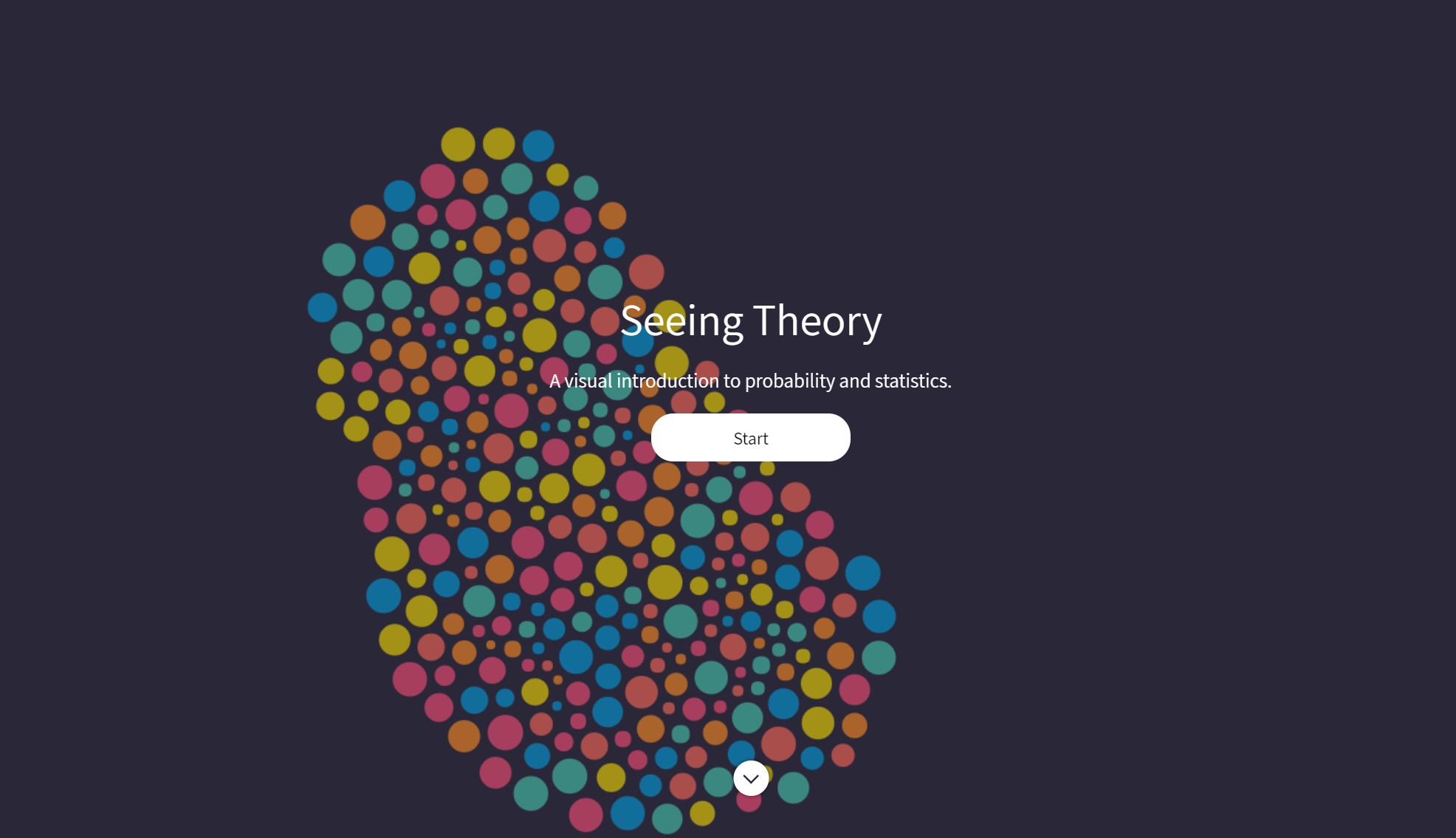
Daniel Kunin’s Seeing Theory project is a brilliant example of thoughtful dataviz. Kunin set out to make “statistics more accessible through interactive visualizations,” and his work absolutely crushes that goal. Seeing Theory has one of the most approachable visualizations of probability and statistics, paired with helpful content. Check out the site: https://seeing-theory.brown.edu
The website was designed using Mike Bostock’s JavaScript library D3.js. If you haven’t heard of Bostock before – and are keen on understanding how an algorithm might randomly traverse a maze – take a look at his Visualizing Algorithms “post,”. Its interactive, informative and simple – or quite simply the gold standard in my book.
Why am I talking of dataviz here? It is clearly one of my passions. More importantly though, I believe that we are not too far from a time when we will ignore datasets if they aren’t visualized beautifully. Or, are we there already?!